WORK
Meluka Australia
Branding & Identity
Paperbark – Tee Tree Honey
CHALLANGE
To assist in the brand’s ongoing evolution I was tasked with leading the creative direction for a rebrand of logo, name and packaging to craft a compelling narrative that encapsulates the purpose and vision
of Australian brand, Meluka Honey.
of Australian brand, Meluka Honey.
OUTCOME
I led the re-naming and re-design of locally owned Meluka Australia Honey brand. The concept of a direct connection from hive to home influenced the design’s simplicity and authenticity, aiming to convey the pure and unadulterated quality of the product. Visuals here showcase two concepts presented.
SCOPE OF PROJECT
Visual Identity
Creative Direction
Logo Design
Label Design
Client
Meluka Australia
Agency
Heard
Inspired by nature
The unspoiled rainforest wetlands of Jendale, described as the source of the golden elixir, inspired and guided the design’s natural and untouched aesthetics. The emphasis on a gentle interaction with nature inspired the choice of earthy and organic tones for the label packaging, reflecting the raw and unprocessed essence of the honey.
Telling the story through visuals
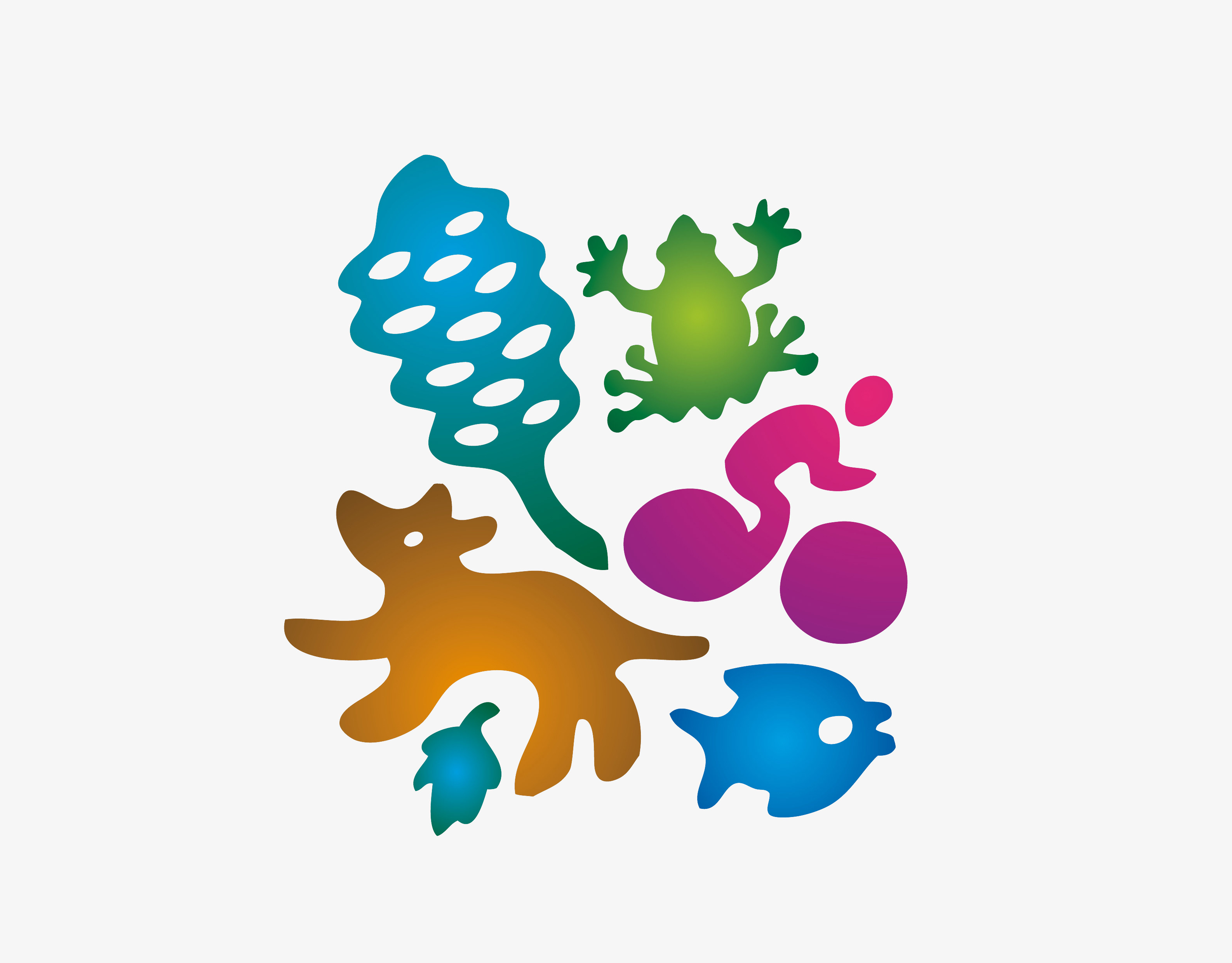
Ancient tea trees infused in the honey prompted the incorporation of subtle visual elements reflecting the local flora, enhancing the overall story of a product that’s as close to nature as possible.
Keen to chat further?


