FEATURED WORK
Deloitte Western Australia
Campaign Branding & Identity
Western Australia – A New Way
CHALLANGE
Develop a central circular design for Deloitte’s Shaping Future Cities – Western Australia series, unifying ten superclusters to define the visual identity for all campaign materials. The design should communicate key themes: Competitiveness, Innovation and Proactivity.
OUTCOME
The outcome resulted in the creation of a central motif that aligned with the various key hot spot areas of focus and the ten superclusters. This motif was adaptable to different digital and physical forms, uniting focus areas from coastline to communities, and commerce to culture. Additionally, a visually playful and distinctive style was established, allowing for potential animation to bring it to life.
SCOPE OF PROJECT
Visual Identity
Theme Design
Brand Collateral
Digital Assets
Merchandise
crossing the nation
“A thriving WA by 2029 requires focus and determination. From our coastline to communities, commerce to culture and more, we are making waves and accelerating our hot spots of activity.” Building upon the developed narrative, we explored multiple areas that could be engaged in the initiative.
identifying the hot spots
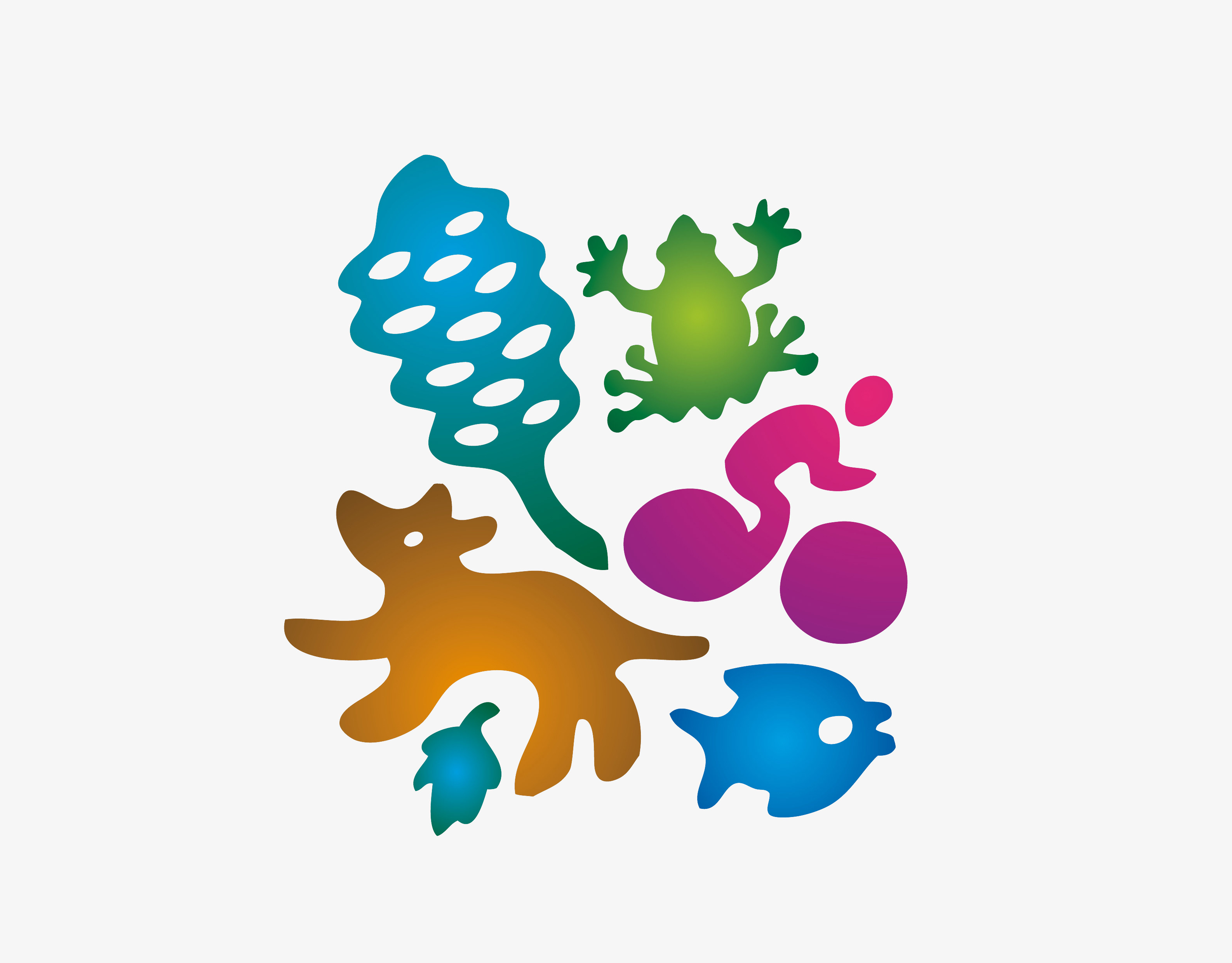
After additional exploration and research, a collection of specific areas was identified. These were translated into a verbal and visual language, employing a variety of natural and engineered objects to depict and symbolise each focal area.
Extending the motif to the superclusters
Expanding beyond the hero motif visual, a broader range of visuals was created to depict the ‘hot spots of activity’ or superclusters. Similar to the initial visual approach for the hero motif, the names of the hotspots were transformed into letter motifs, incorporated within a circular framework, and surrounded by diverse objects.
Setting things in motion
The subsequent phase involved implementing the two visual motifs into the website and other branding avenues. The dynamic animated letter forms proved effective as an initial landing page, transitioning gradually to ultimately unveil the
title ‘A New Way’.
title ‘A New Way’.
On the big screen
Continuing from the website design, the hero motif was expanded to digital billboards, allowing for an unlimited display of letters and objects in motion.
Dynamic Branding
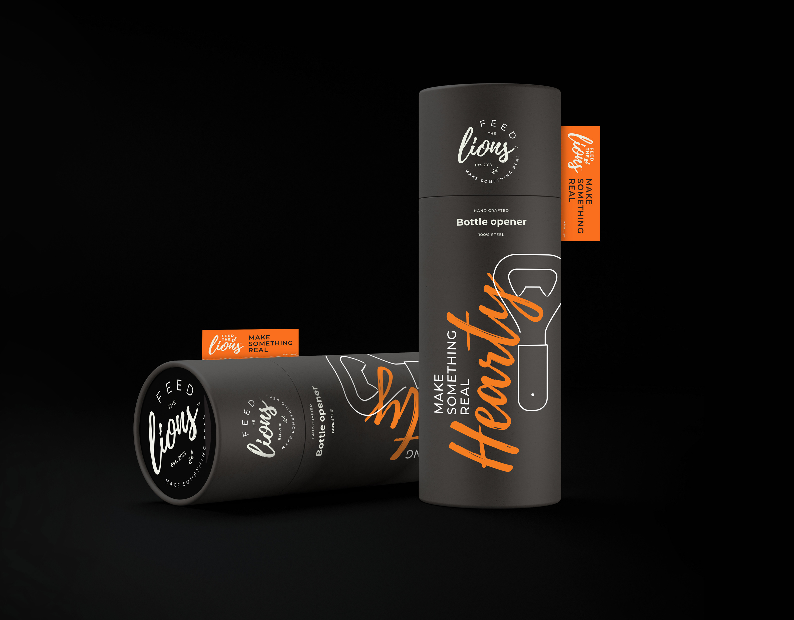
The visual branding wasn’t limited to going
digital it was also implemented across a range
of merchandise, enabling people to bring it
home and integrate it into their daily lives.
digital it was also implemented across a range
of merchandise, enabling people to bring it
home and integrate it into their daily lives.
Keen to chat further?

