FEATURED WORK
Feed the Lions
Visual Identity
Make something real
CHALLANGE
Create an engaging brand identity and packaging for a burgeoning home cooking company aimed at an audience seeking tools to delve into the joy of preparing and cooking meals.
OUTCOME
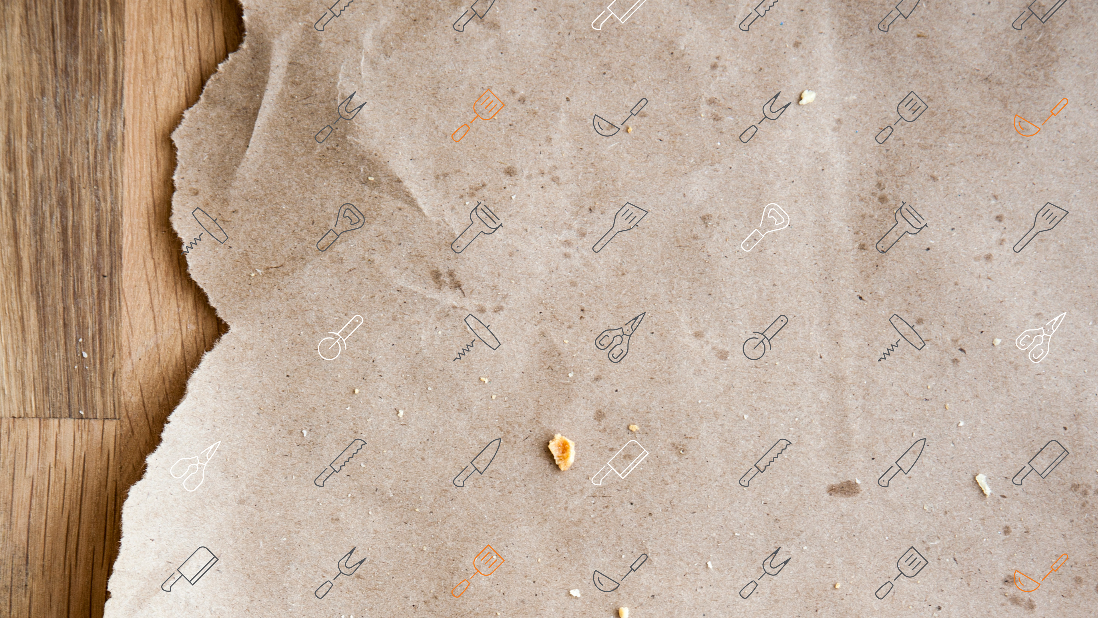
I helped ‘Feed the Lions’ in creating their visual identity, starting with a refined logo and stamp design. This style extended to iconography, typography, and distinctive packaging, seamlessly integrated into their website and livery materials.
SCOPE OF PROJECT
Visual Identity
Creative Direction
Logo Design
Brand Messaging
Packaging & Label Design
Website Design
Getting the ingredients right
The logo was crafted using a vibrant blend of sans-serif and script fonts, featuring bold tangerine orange against a black backdrop. This was later honed into a monochromatic stamp mark suitable for application on products and packaging labels.


TOOLS FOR COOKING COURAGE
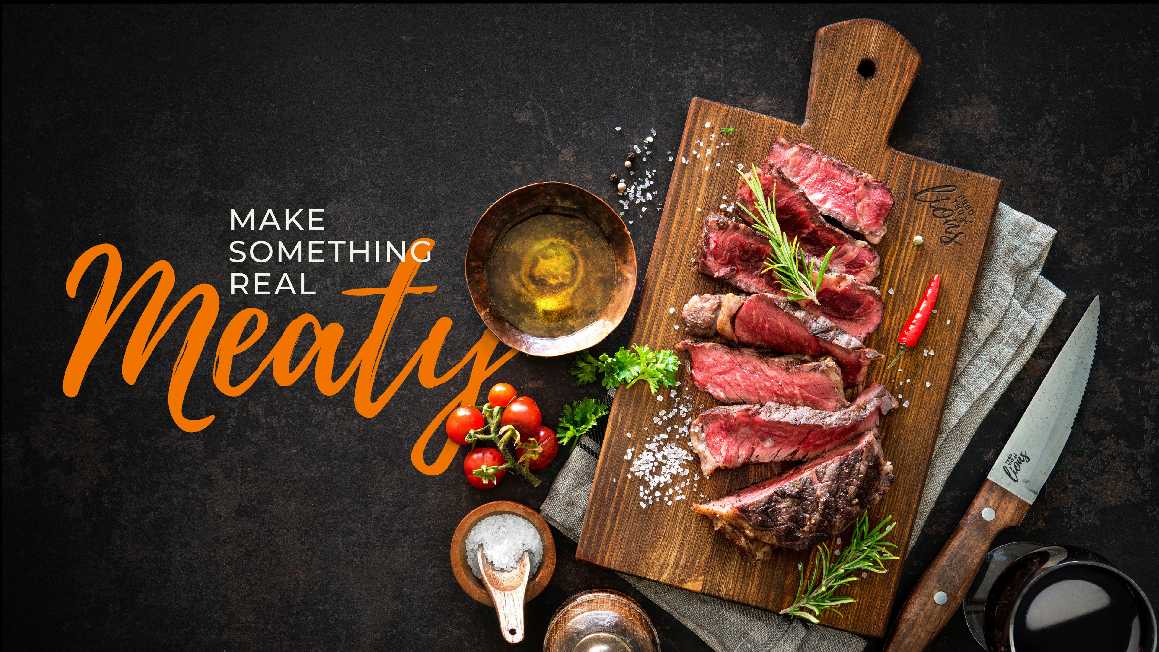
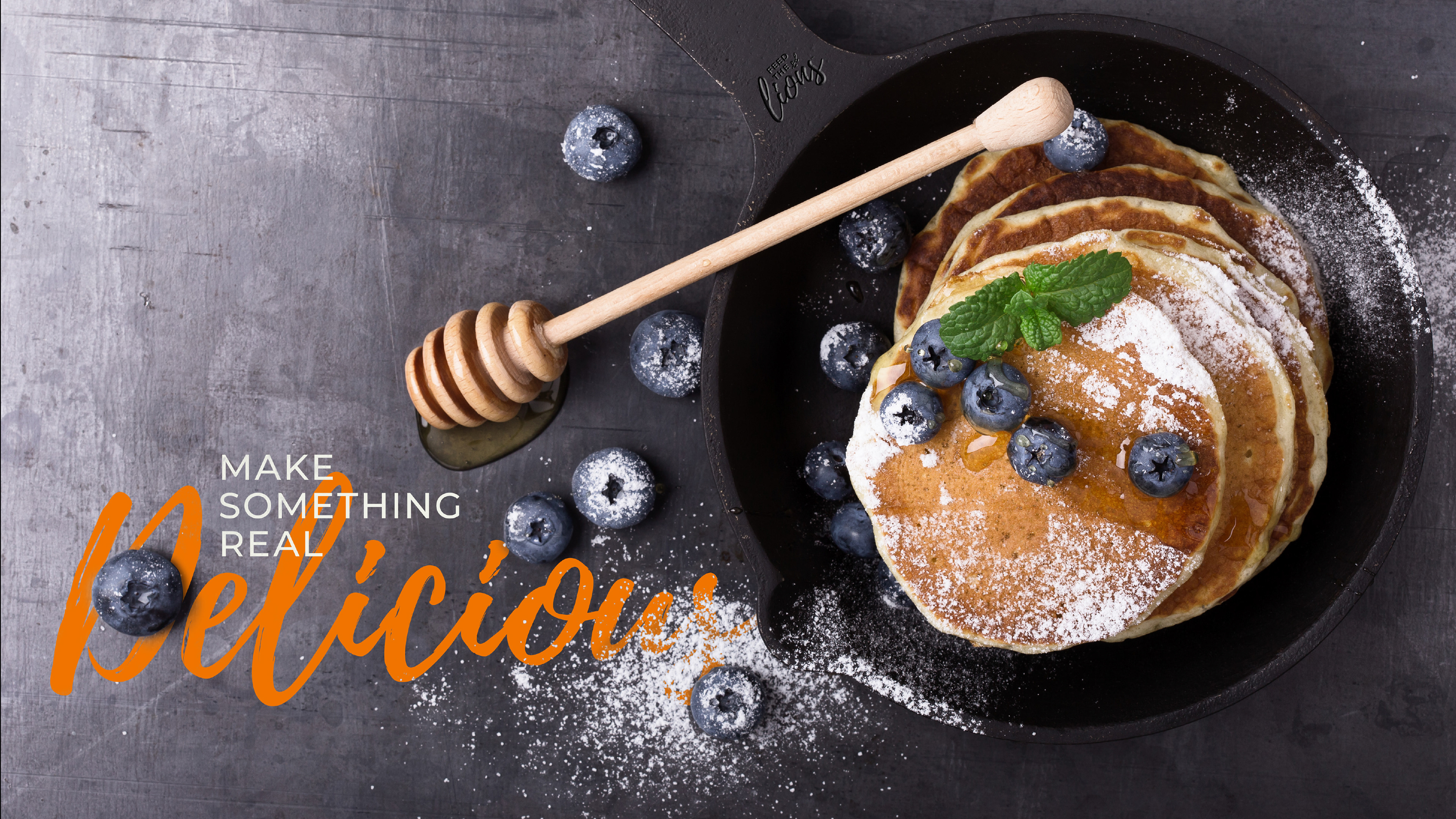
The ‘Make Something Real’ tagline was enhanced by incorporating dynamic verbs. Each word aligned with unique product iconography, resulting in packaging labels that offered playful combinations both visually and in product labeling.
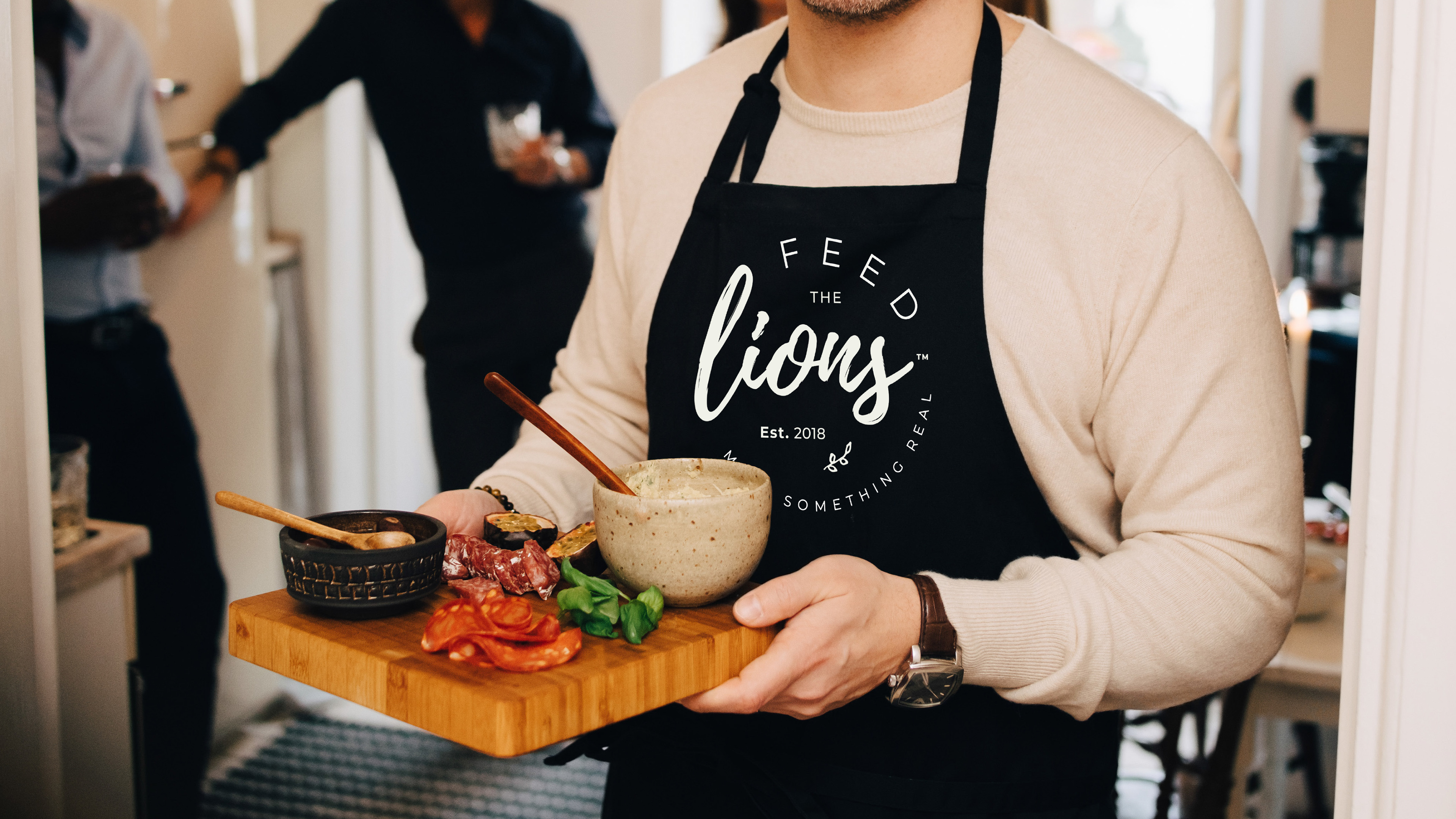
Wear it on your sleeve
Our aim was to ensure the brand elements conveyed authenticity and approachability. We wanted to emphasise that anyone possesses the courage and determination to cook, and ‘Feed the Lions’ can provide that additional boost of courage.
Extending the messaging
Employing a similar methodology as seen in the packaging labels, an array of image and message combinations could be devised for utilisation across websites and email communications.
Keen to chat further?

