
Feed the Lions — Make Something Real
Feed the Lions
Feed the Lions was created to encourage people to cook with confidence and make something real. The brand needed to feel energetic and approachable, with enough personality to stand out across products, packaging and digital channels.
Visual Identity • Brand Messaging • Packaging • Website • Graphic Design
Making cooking feel more human
The challenge was to create a brand that moved away from the conventional language of cooking products. It needed to feel less instructional and more like an invitation to get involved.
Give the words some bite
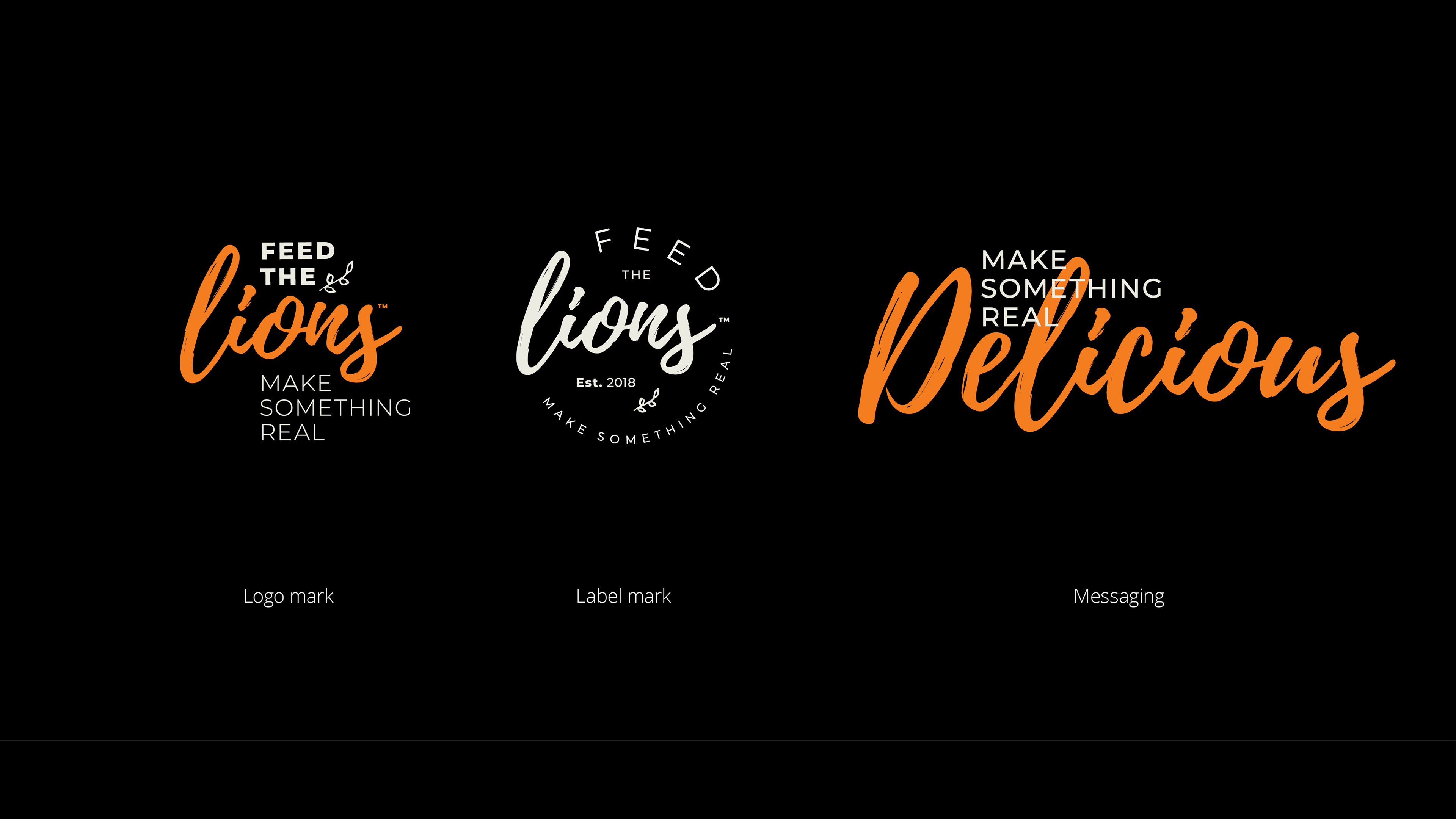
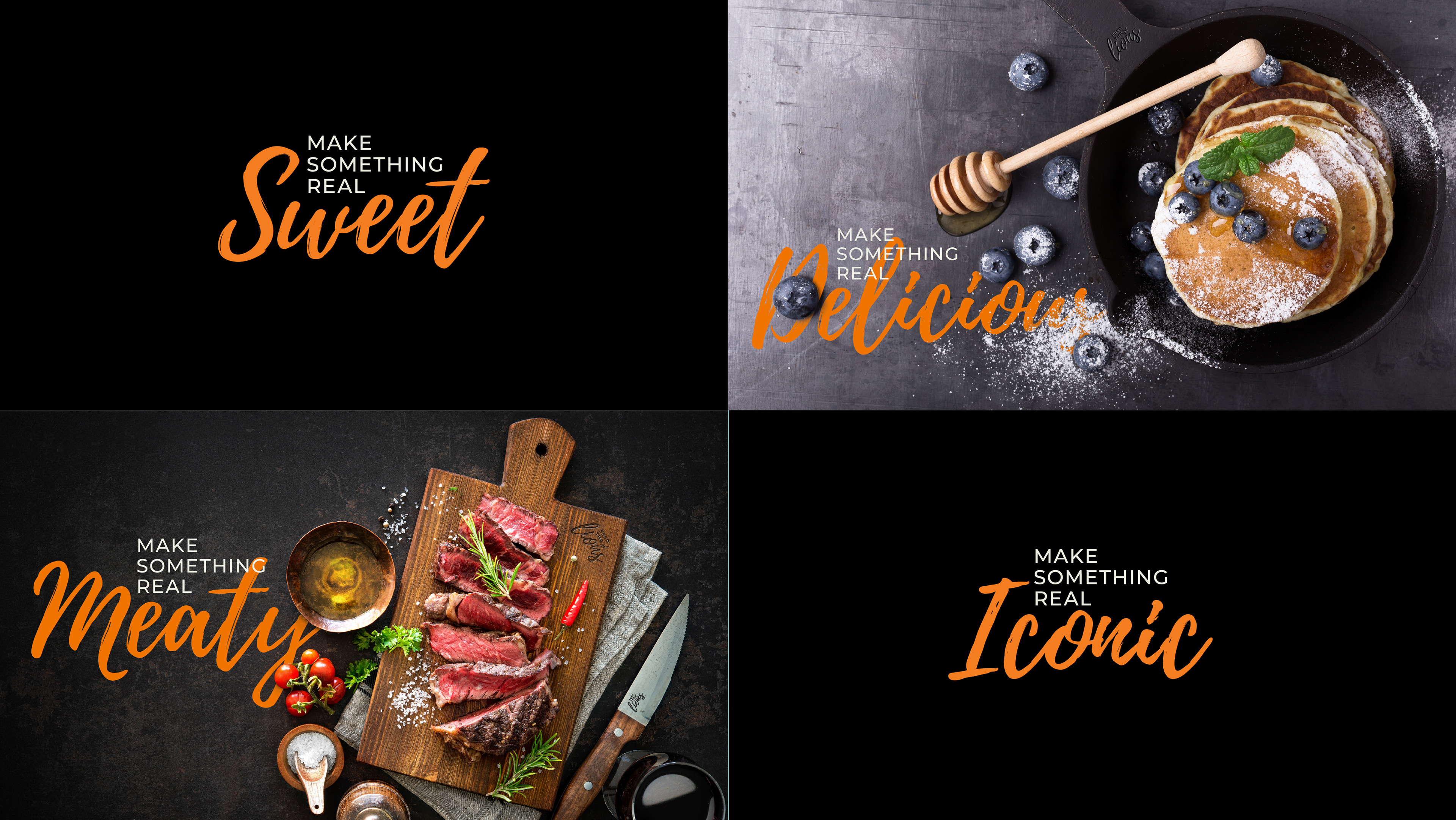
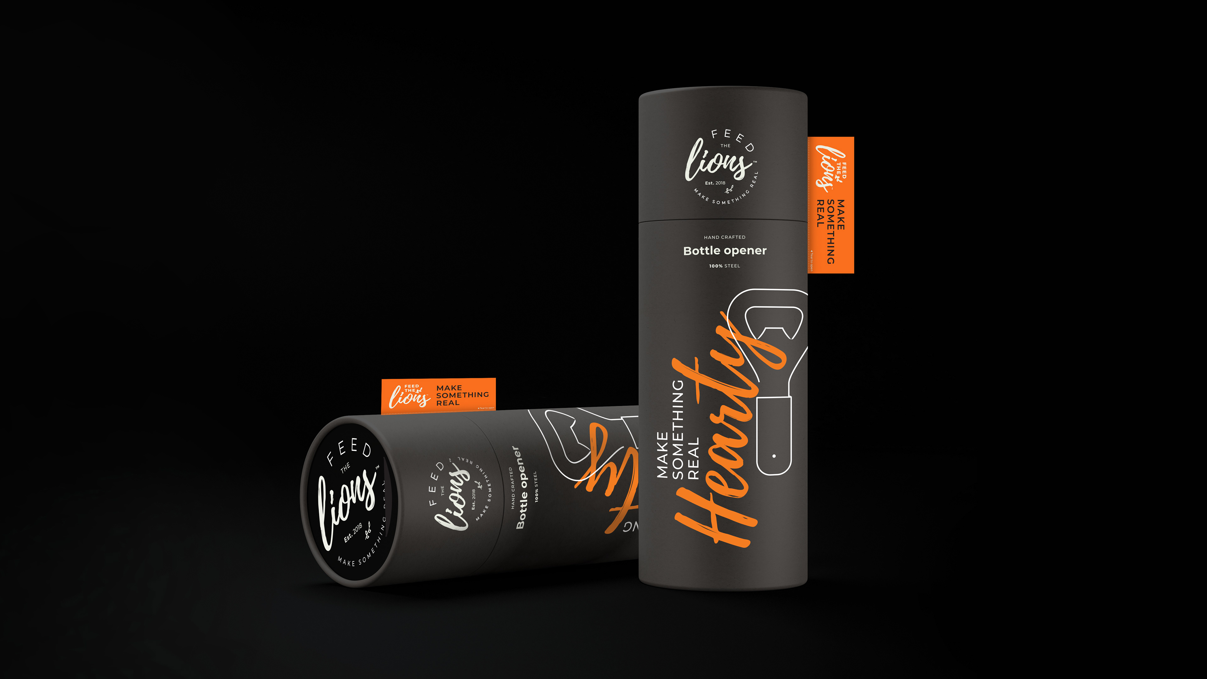
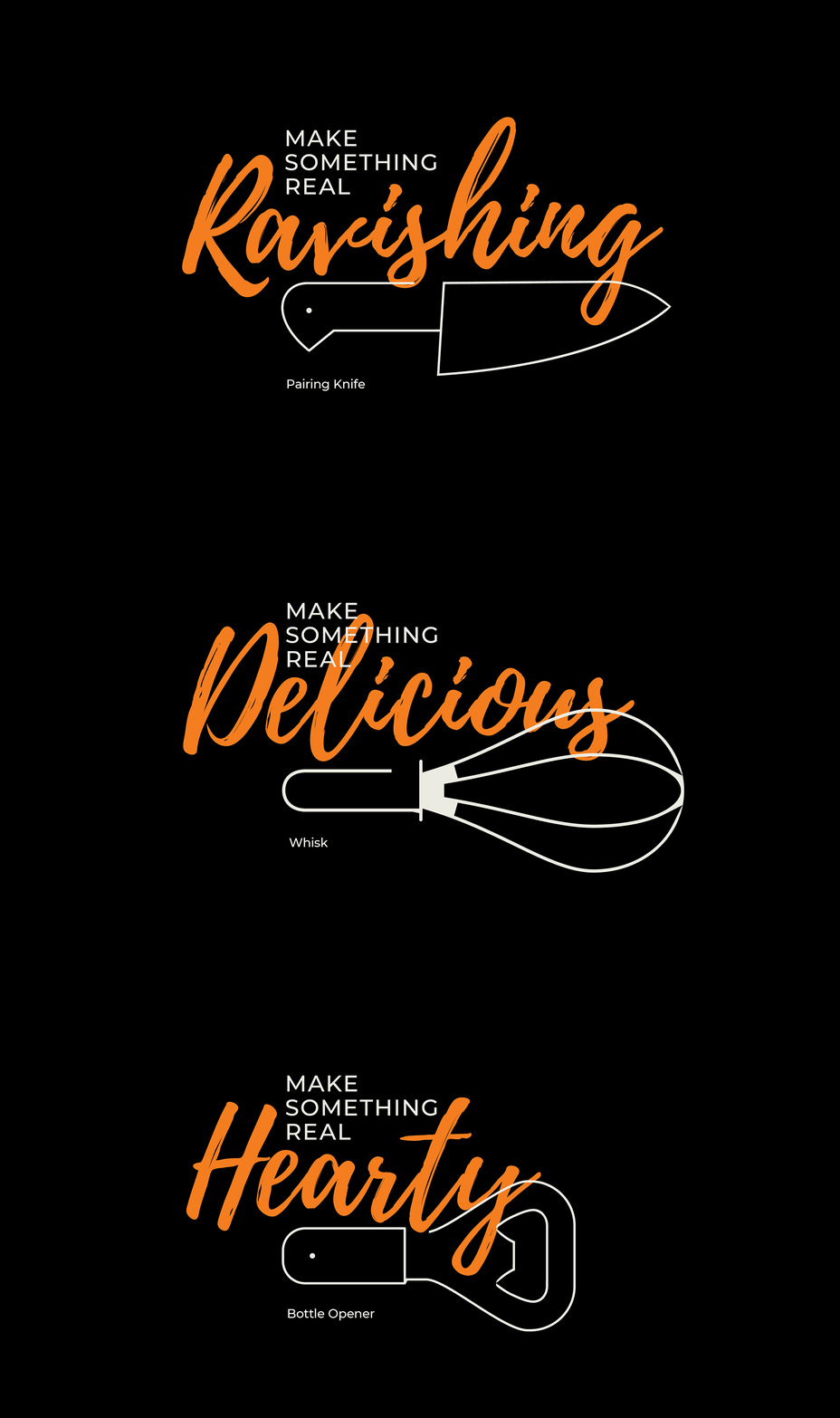
The identity combined a refined logo and stamp with a playful system of typography and product iconography. ‘Make Something Real’ became a flexible verbal platform, giving individual products their own combinations of action, attitude and personality
A system built for the shelf
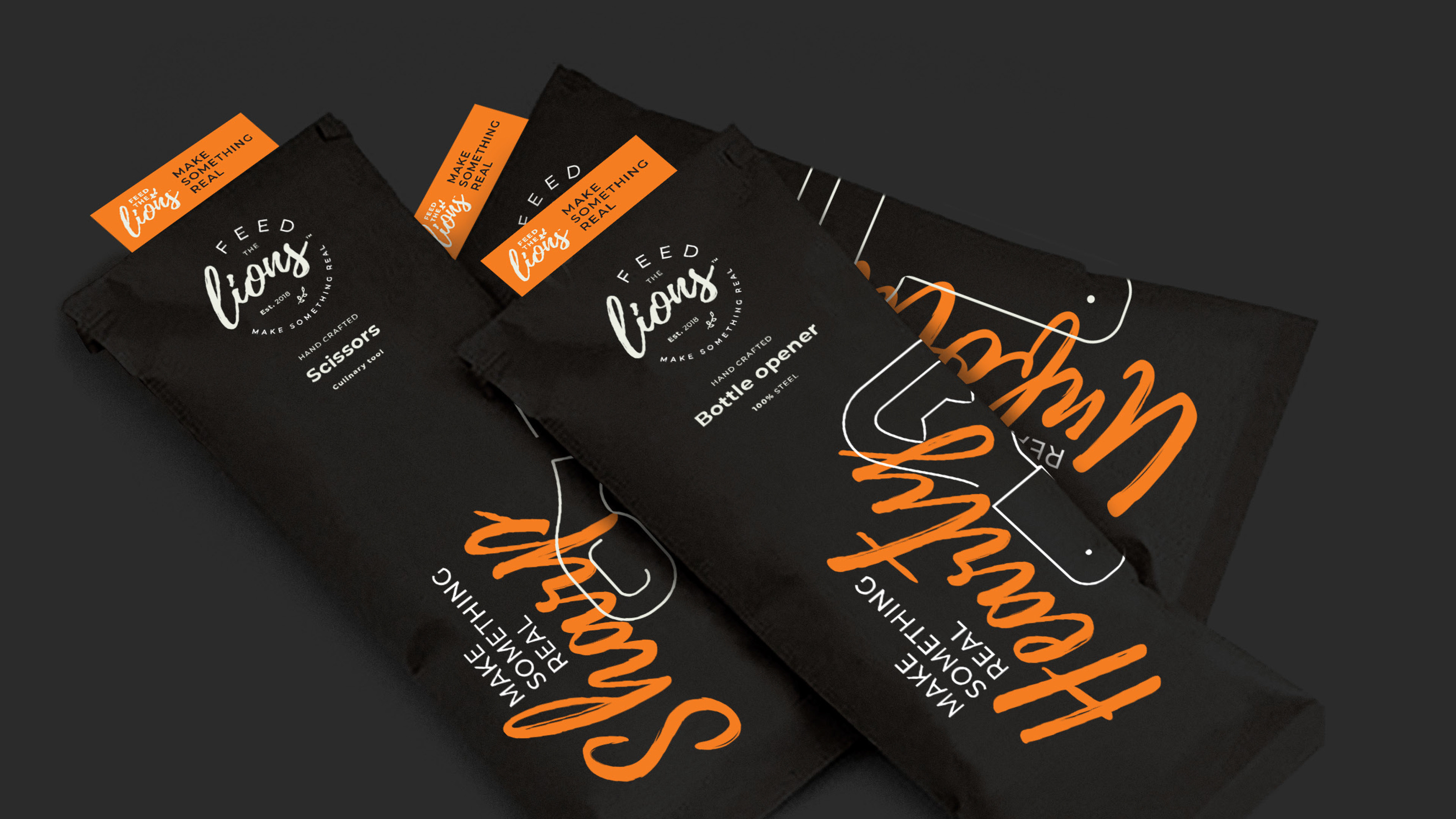
The visual language was designed to work particularly hard on packaging, where combinations of words, icons and colour could create a family of products without making them look identical. The same approach extended into the website and supporting communications.
My role
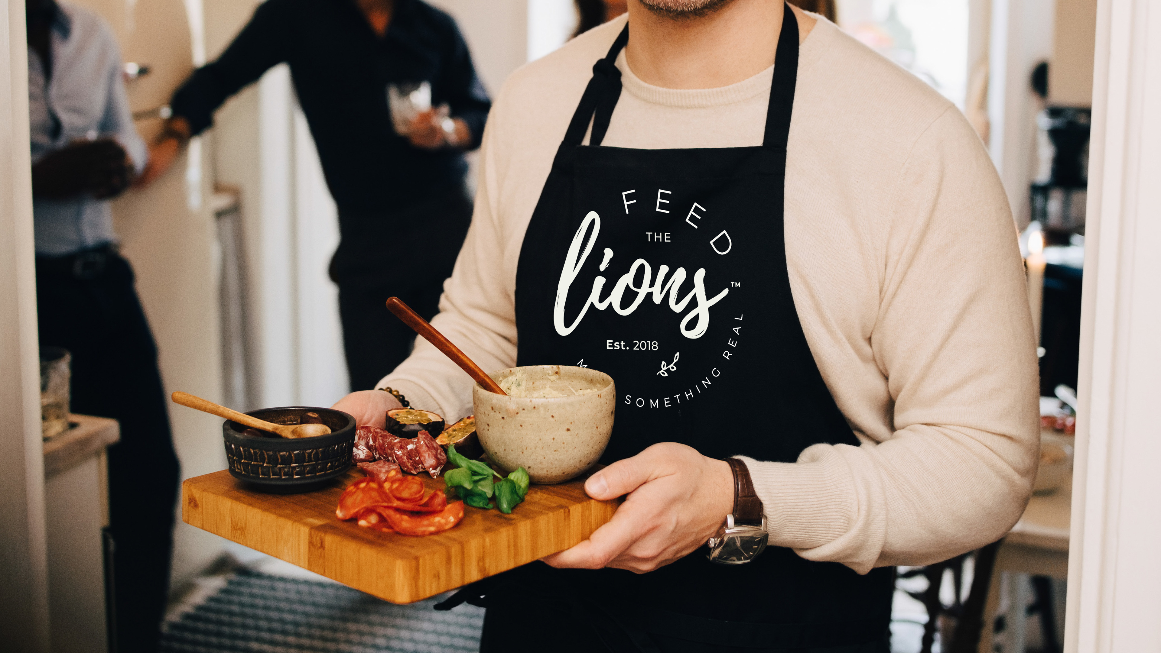
I developed the identity and creative direction, establishing the visual and verbal system and applying it across packaging and digital touchpoints.
Creative direction & identity • Brand messaging & concept development • Packaging & label design • Website & graphic design
Related Projects
Ocean to Stable
Lorry Boys — Jim & Joe’s