
Greater Union — Updating an Australian icon
Greater Union
Greater Union had carried essentially the same logo and wordmark since the late 1970s. The task was not simply to modernise the identity, but to evolve a familiar Australian cinema brand without losing the recognition built over decades.
Branding & Identity • Creative Direction • Advertising • Promotional Design • Point of Sale


An icon ready for its next act
The existing identity had strong recognition but was beginning to feel dated against a changing competitive landscape. The challenge was to understand what made it familiar, what was holding it back and where the brand could move next.
Keep the star. Change the story.
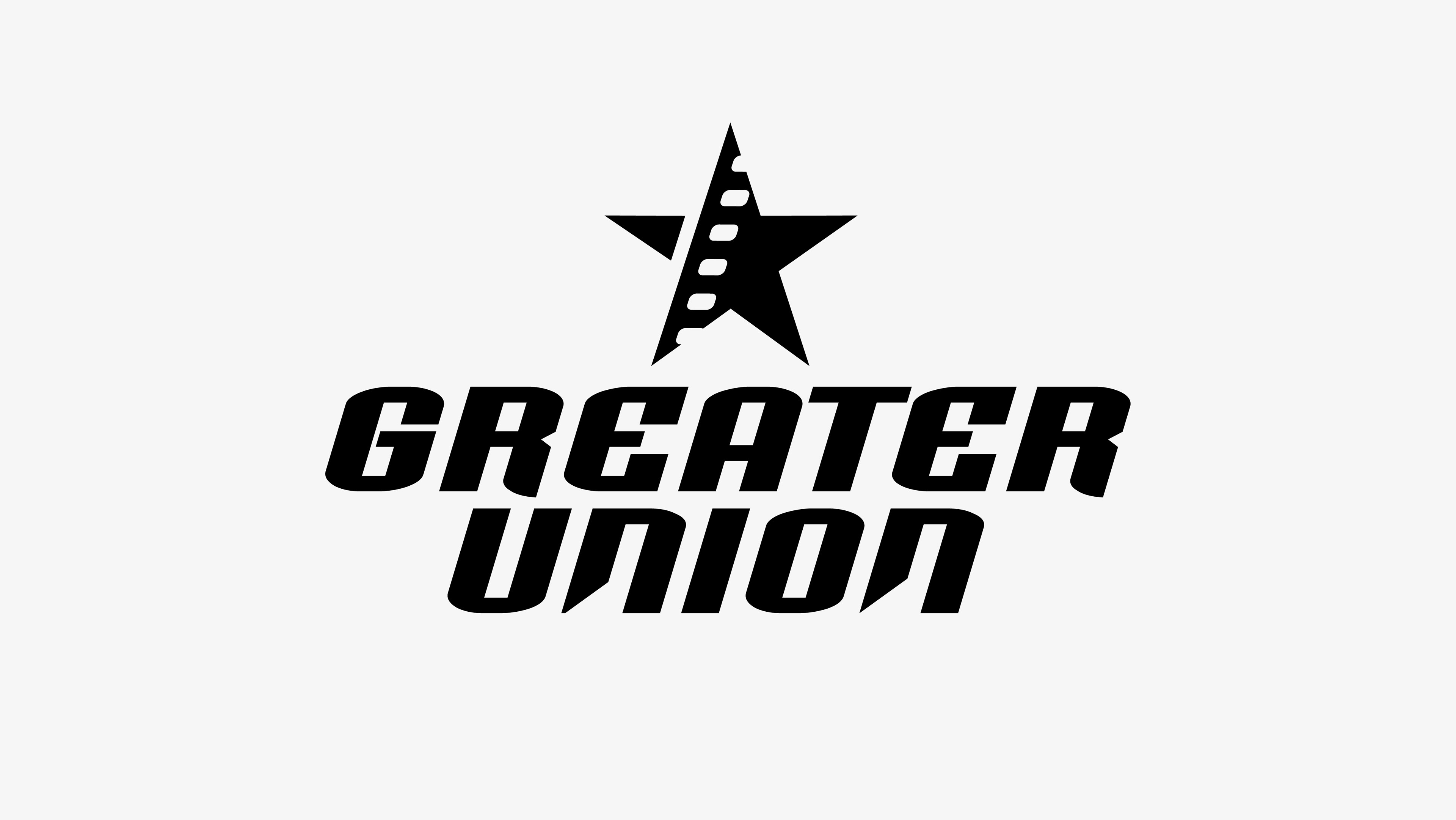
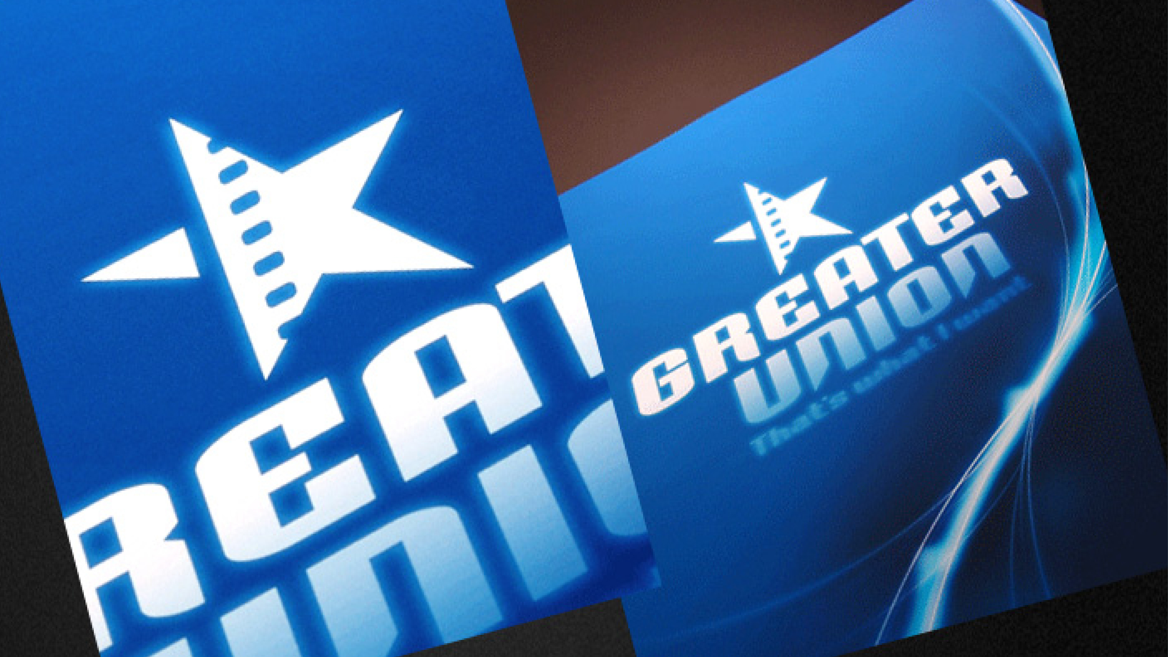
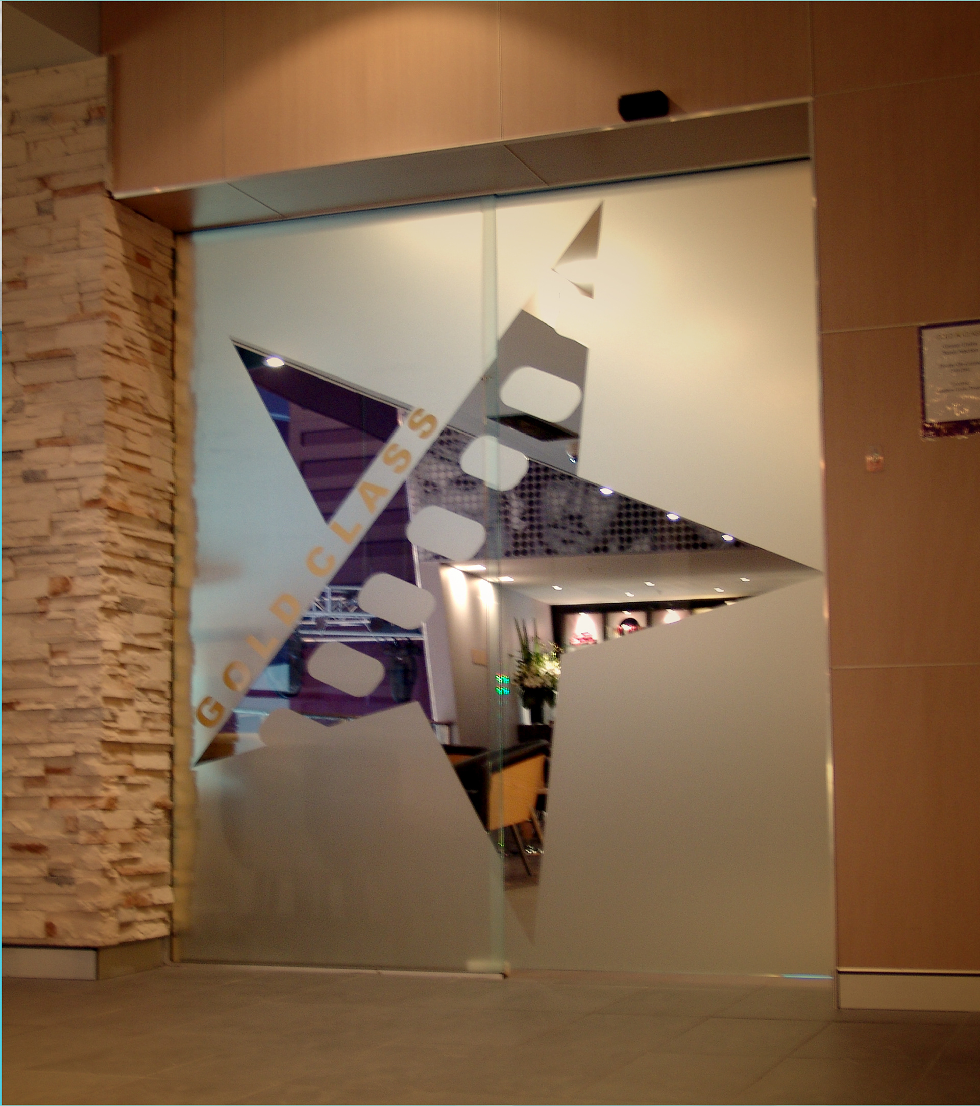
The star within the existing wordmark became the starting point for a new film-inspired motif. The visual language introduced more energy, movement and contemporary character while maintaining a clear connection to the original brand.
From logo to experience
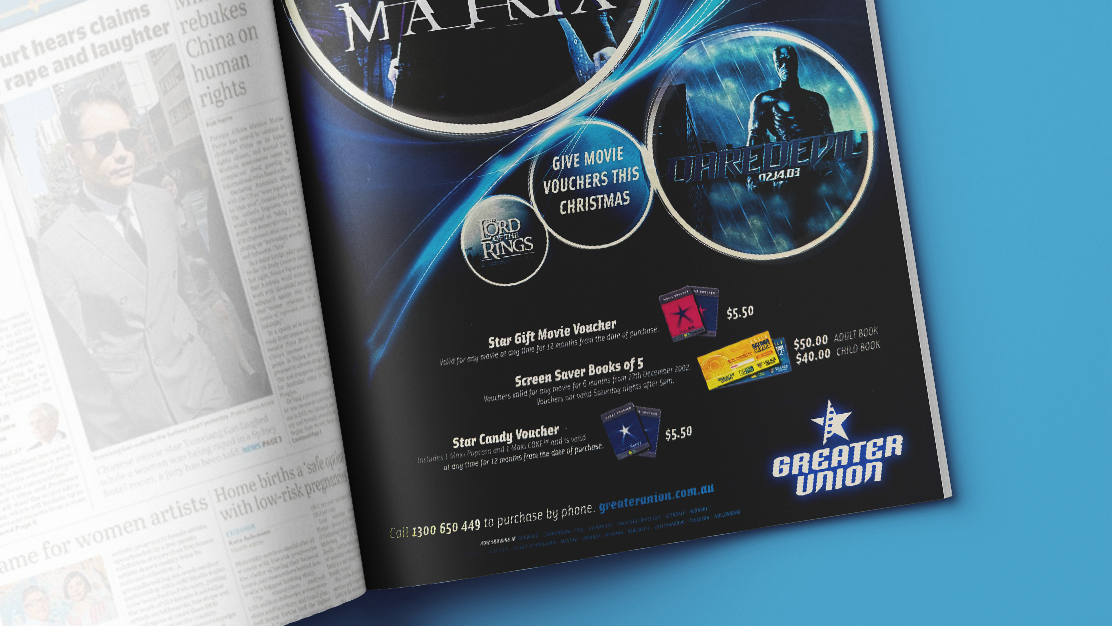
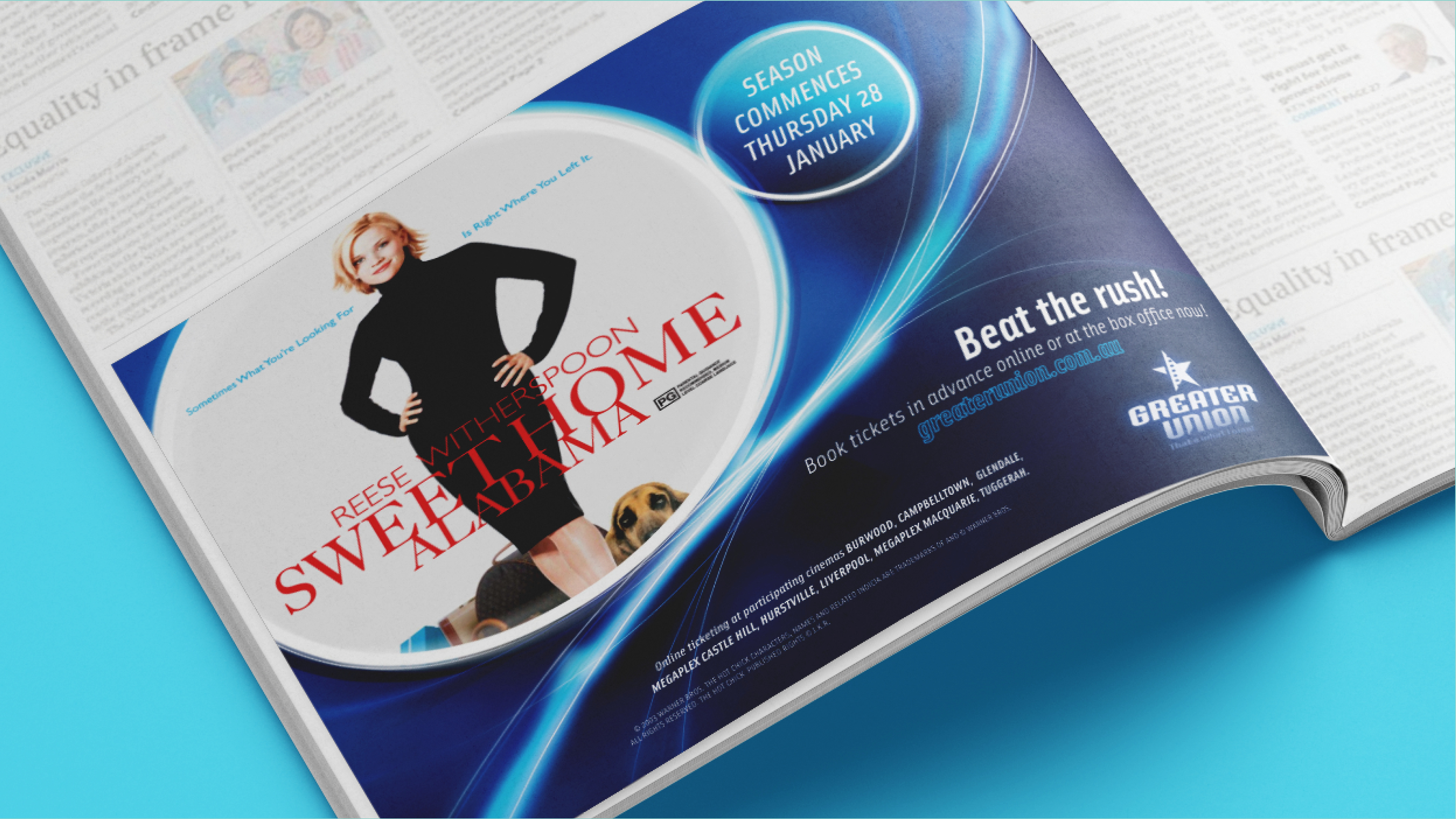
The refreshed identity was extended into advertising, promotions and point-of-sale materials. Supporting graphics created a broader system so the new identity could behave consistently across different cinema environments and campaign applications.
My role
I led the creative development and design evolution of the identity, translating the new direction into a broader marketing system.
Brand identity development • Creative direction & art direction • Advertising & promotional design• Point-of-sale applications
Related Projects
Meluka Australia — Paperbark
Feed the Lions — Make Something Real