
Meluka Australia — Paperbark
Meluka Australia
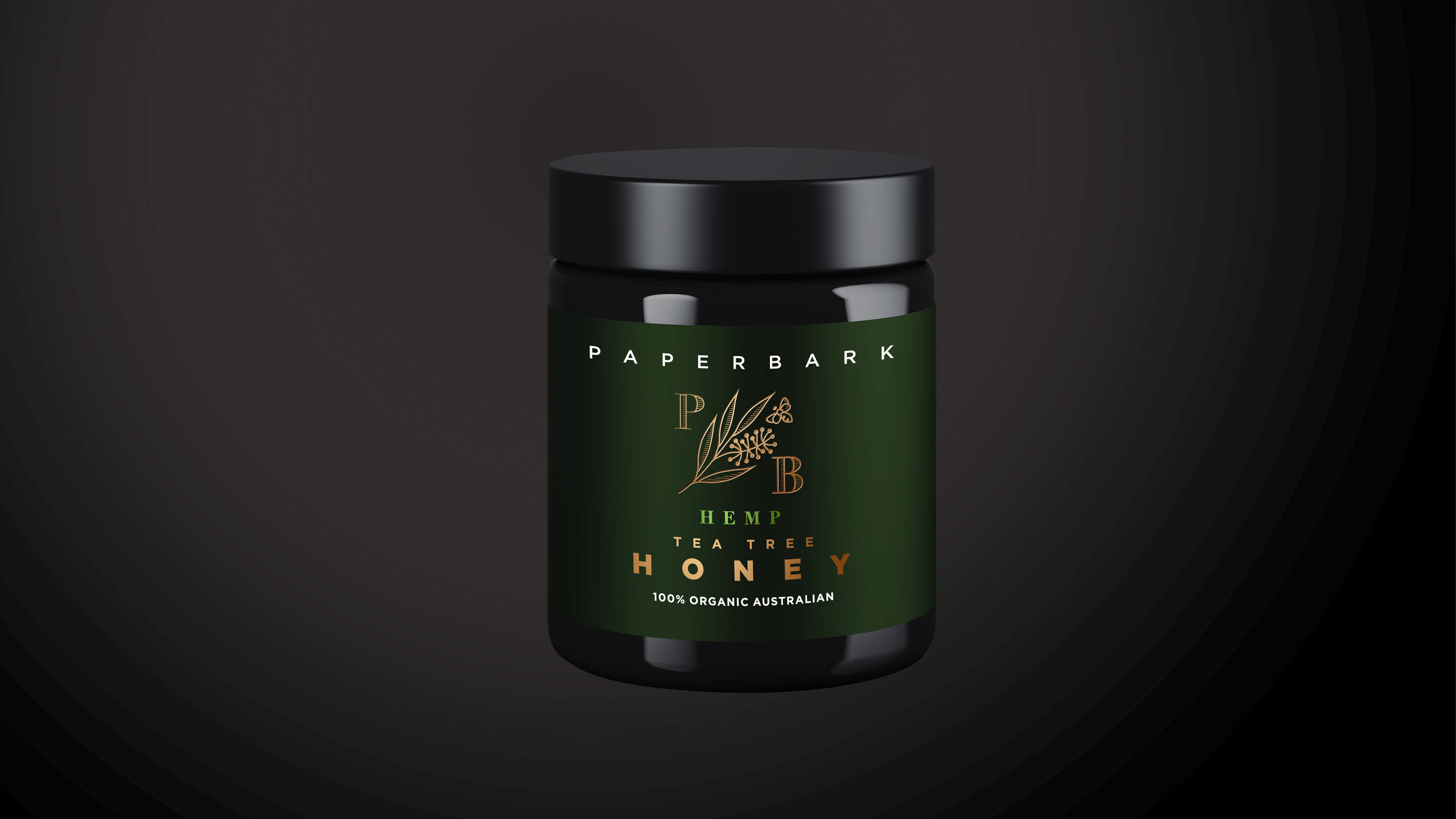
Meluka Australia is a locally owned honey brand connected to the natural environment of northern New South Wales. The project was an opportunity to evolve the brand through a stronger name, identity and packaging story grounded in the product’s origins.
Visual Identity • Creative Direction • Naming • Packaging • Brand Development
Closer to the source
The brand needed to communicate authenticity and provenance in a crowded natural-products market. The challenge was to make the connection between the landscape, the honey and the people behind it immediately understandable.
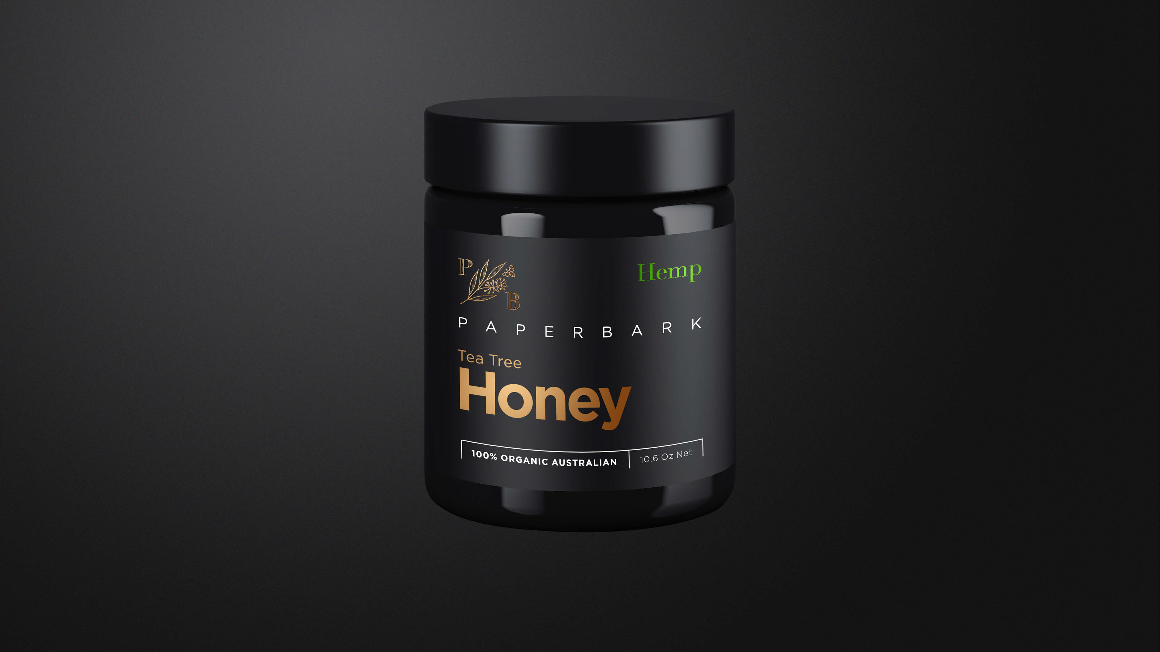
Inspired by the paperbark
The creative direction drew from the surrounding rainforest wetlands and the tea tree environment where the honey originates. Natural textures, earthy tones and restrained graphic elements created a visual language that felt close to the source.
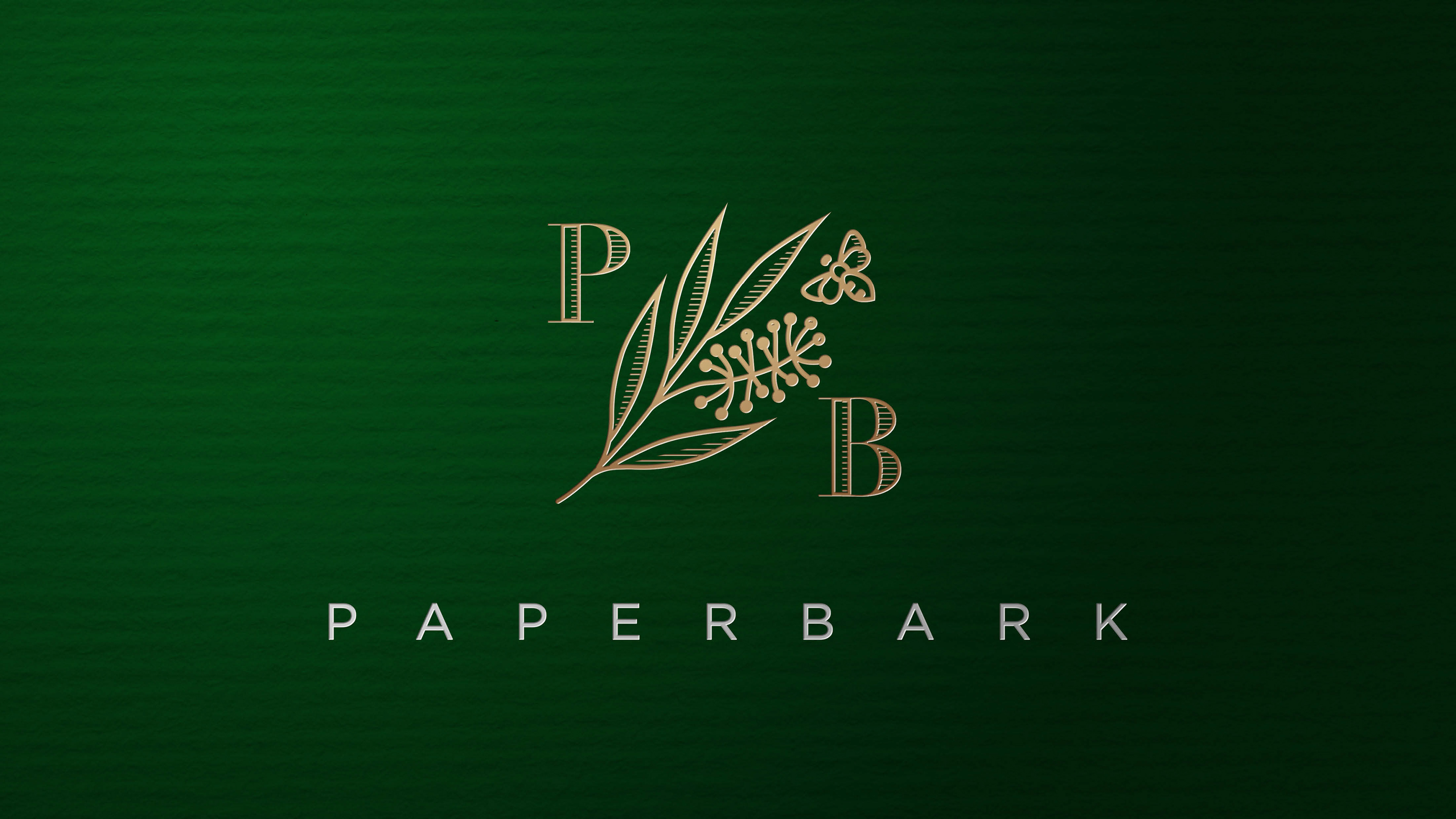
From hive to home
The identity was developed as a system rather than a single label, allowing the packaging to communicate origin, product character and quality consistently. The result balanced a contemporary Australian aesthetic with the rawness of the natural story.
My role
I led the creative direction, including the naming and identity development, then shaped the visual language and packaging concepts around the brand story.
Creative direction & concept development • Naming & visual identity • Packaging & label design • Brand development
Related Projects
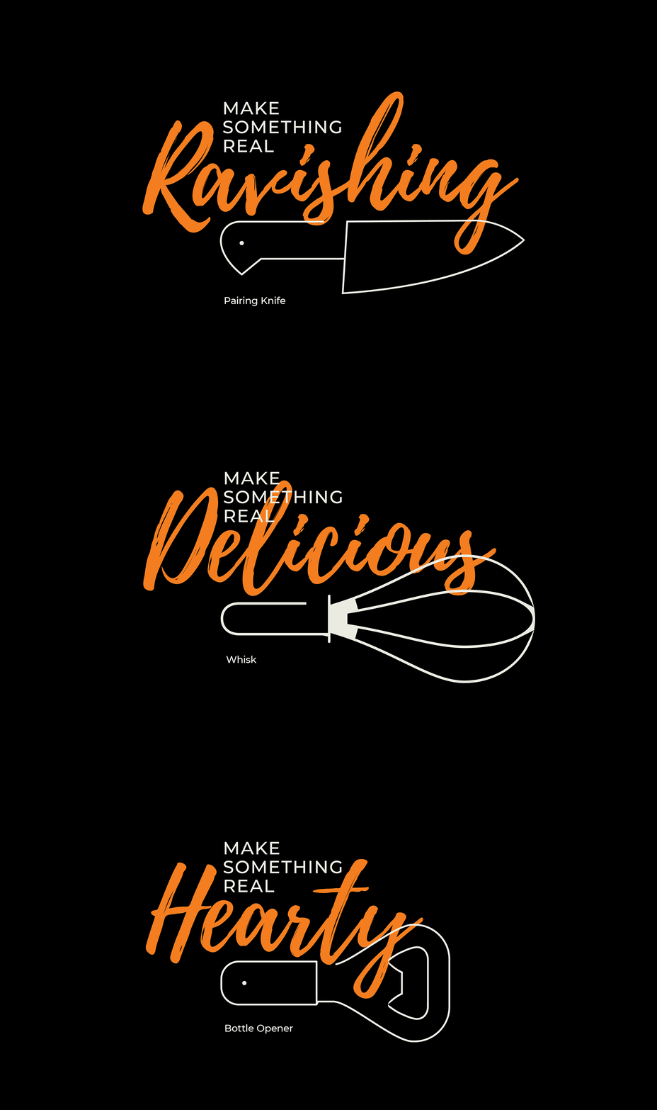
Feed the Lions — Make Something Real
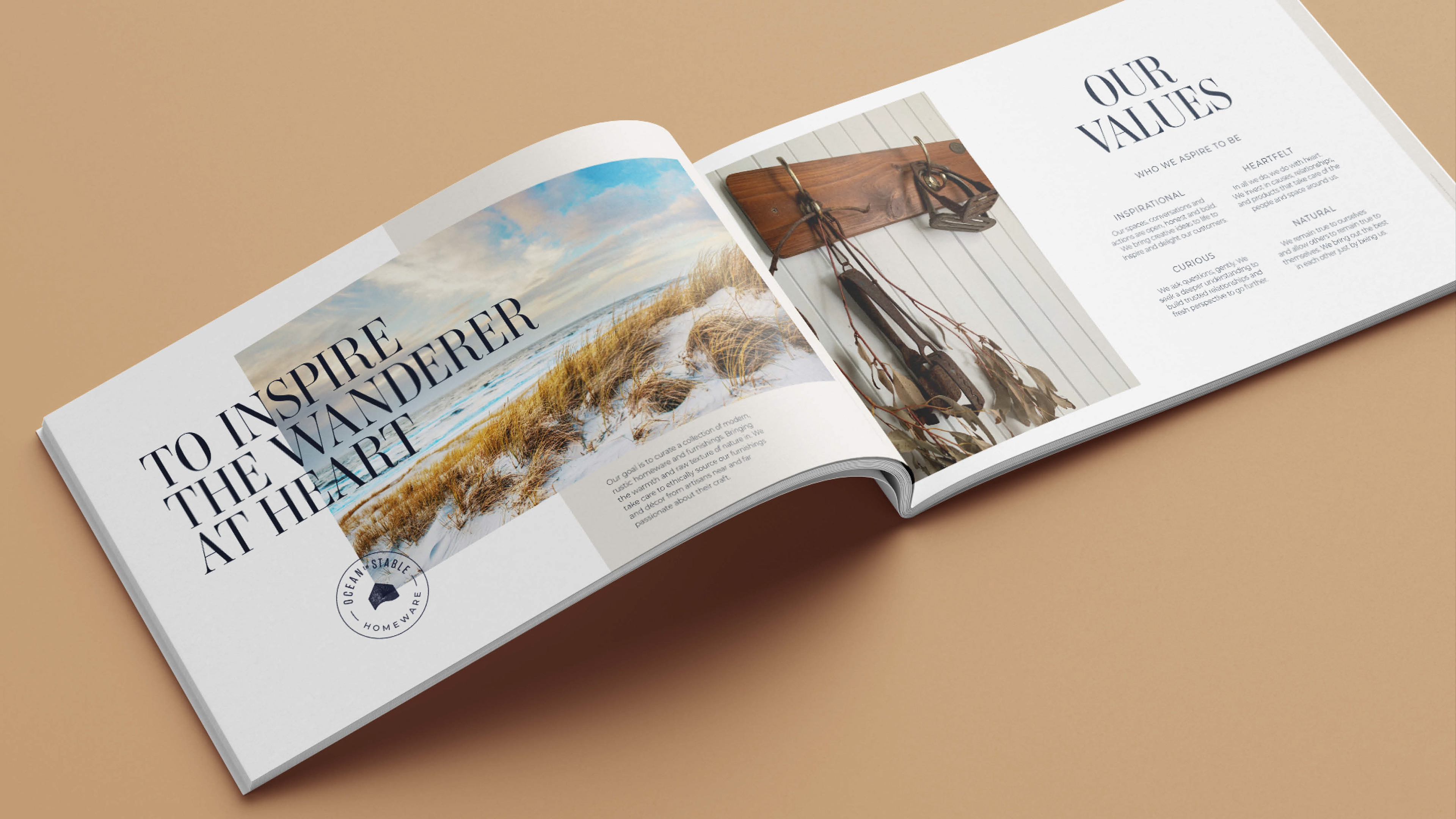
Ocean to Stable